Female Art Students around 1890, at the Pratt Institute of Art, Brooklyn, New York, where Pamela Colman Smith studied.

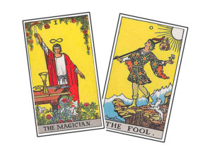
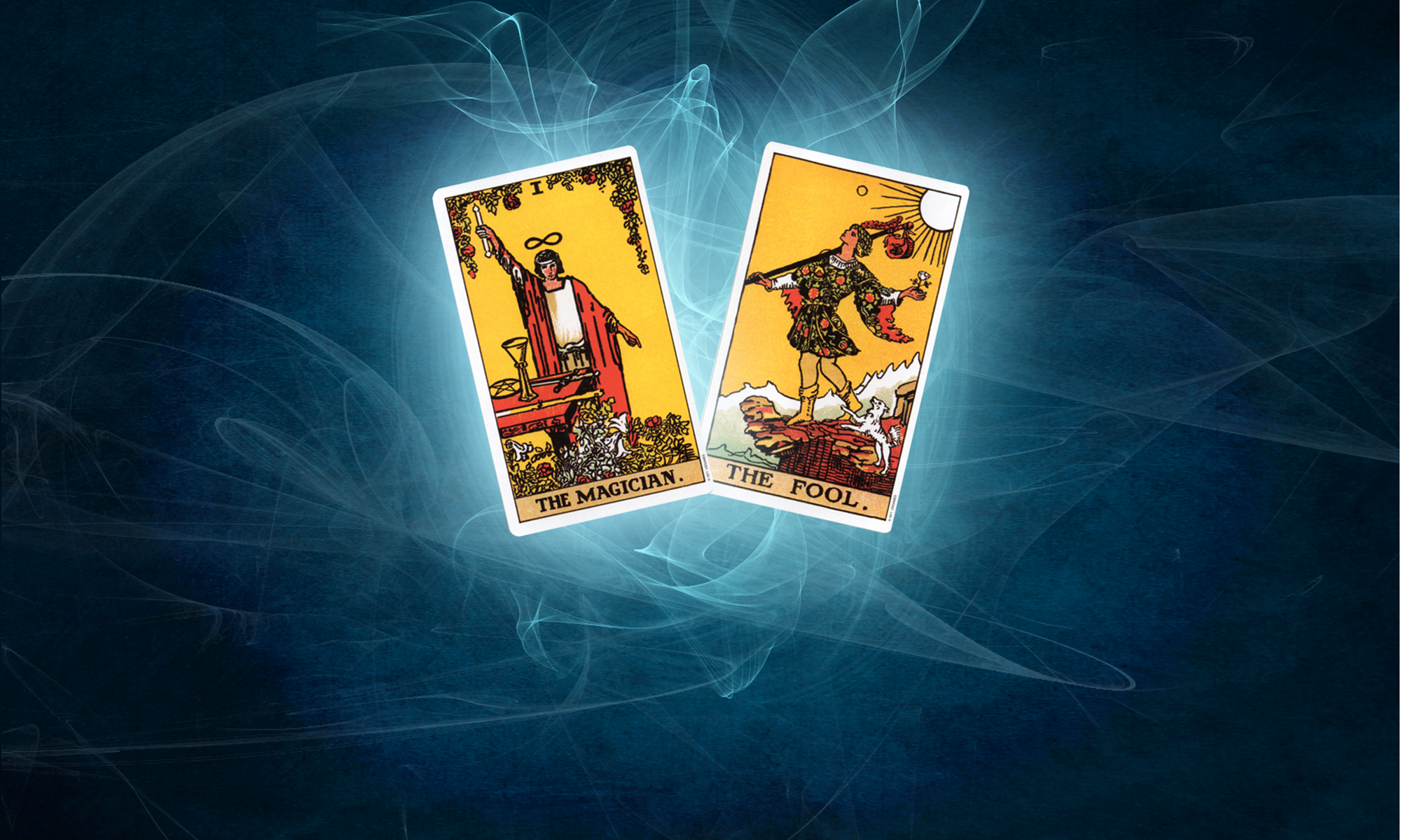
This strange little graphic puzzled me during my adolescence. It was at the bottom of each of the tarot cards in the Rider Waite tarot deck, a deck I was obsessed with and which I hand-colored the black-and-white images in a long-lost blue cloth-covered book. Was this symbol an Egyptian hieroglyphic? A snake crawling up a post with arms? What was the dot, which appear only in some of them? It certainly didn’t like like an ‘R’ for Rider and there was no ‘W’ in this design at all. So, if it wasn’t short for Rider-Waite, the name of the tarot deck, what was it?
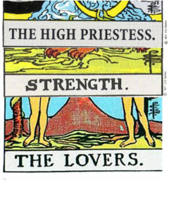
Some cards had the initials in plain sight, on the right hand side of the card. Others were like the ‘Nina’ in a sketch by Albert Hirschfeld, a hidden treasure in the New York Sunday Times’ theatre section. See if you can find the P C S in these tarot cards:
 Eventually, I found out these were the three letters: P C S. They stood for Pamela Colman Smith, who did the illustrations for the Rider Waite tarot deck. What do words mean in the goods that are manufactured? Who gets credit for designing what and does it matter that Pamela’s name was not mentioned in the cards retail name? You can see she hand lettered the name of each card in addition to designing and signing them.
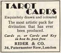
Here is the first advert for Pamela’s tarot cards when they were published in 1909 in London:
I have been thinking a lot about Pamela Colman Smith today, as my book, Magician and Fool, has now been listed for sale for the first time on Amazon. Years in the making on my end, I think of all the years Pamela spent immersed in her artistry, creating these tarot cards and all her other artwork. How do you get your artistic children out into the world? How do you market it and fine tune it so that it is seen in the same eyes as the creator?
This past Saturday Night Live there was a very funny sketch Ryan Gosling starred in about the font used for promo materials for the movie Avatar. Gosling’s character was obsessed because the font used in all the media for the movie was Papyrus, seemed like a such an easy cheat to use.
In this blog, as I explore the creative path on Pamela’s artwork found the light of day, I will try to honor her artistic contributions and process. She was truly ahead of her times in many ways. And she designed her own font for her cards.